As nice as John's new theme is I have to say that on my old laptop, which ran at 1024x768, the header area takes up far too much space. In fact, on that old computer I could only see the top half of the article title when going directly to his page. When I see all header and/or advertising before I see content I go somewhere else. I'm not against monetizing your website (I sell advertising here) but I am against the practice of shoving everything but your content above the fold.
I am currently looking into creating some custom themes for several of my blogs but before doing so I took a quick view at the Google Analytics information for one of my blogs to see what screen resolutions people are using to visit the site. the following data is a short sampling of data from PokeFarm dot com.
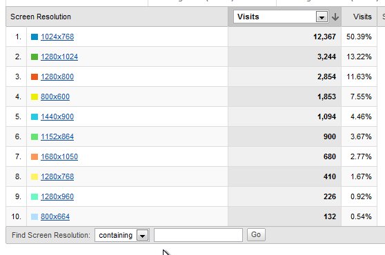
As you can see the majority of visitors use a screen size of 1024x768 or higher. Because 50% of my visitors use 1024x768 I will probably aim to make the site look best at that resolution. As for those who run with a smaller resolution? Well, all 8.5% of you should consider getting a bigger monitor!
There are benefits to a blog redesign not least of which is the freshness factor. Even here on hmtk dot com I can feel the malaise of familiarity creeping in. There is a certain blindness to some areas of the page. Do you even notice the advertising anymore? My checking account balance says that most of you are ad-blind on here!
Unlike John Chow who suggested readers quit complaining and buy a bigger monitor while also saying the site was designed with 1024x768 in mind I'm going to make sure the site looks good to someone browsing at the most common screen resolution.
At any rate, expect some blog redesigns to happen around these parts soon. I'm checking out color schemes right now ;)